css
box-shadow
CSS3:box-shadow 區塊陰影
2019/10/01 13:00:00
0
2424
想在圖片或是區塊加上陰影效果,只要利用 css 的 box-shadow 屬性就可以輕鬆完成。
-
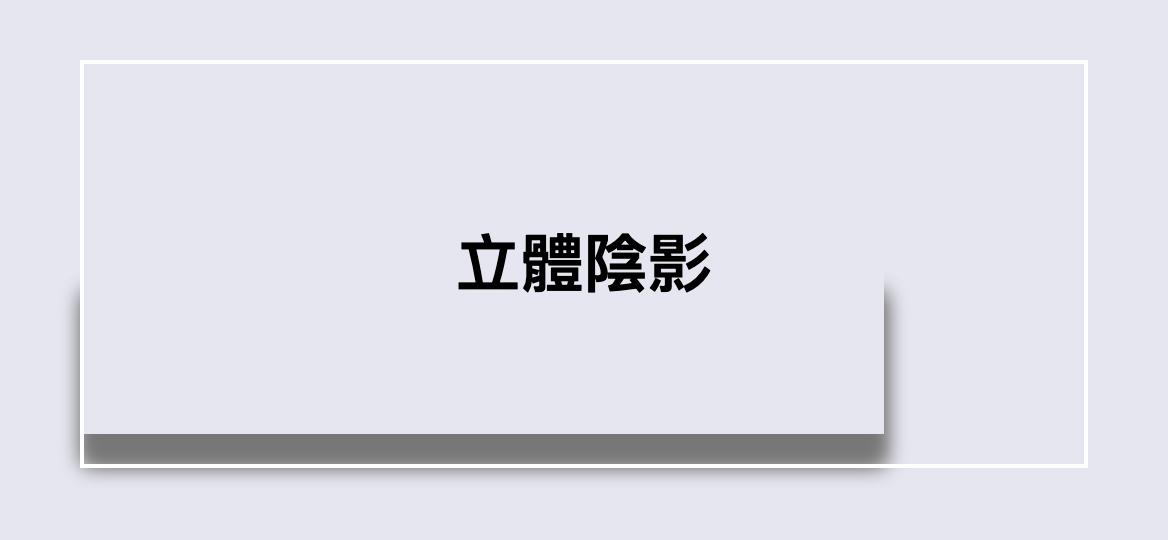
首先,建立網頁背景及 500px 的白色區塊:
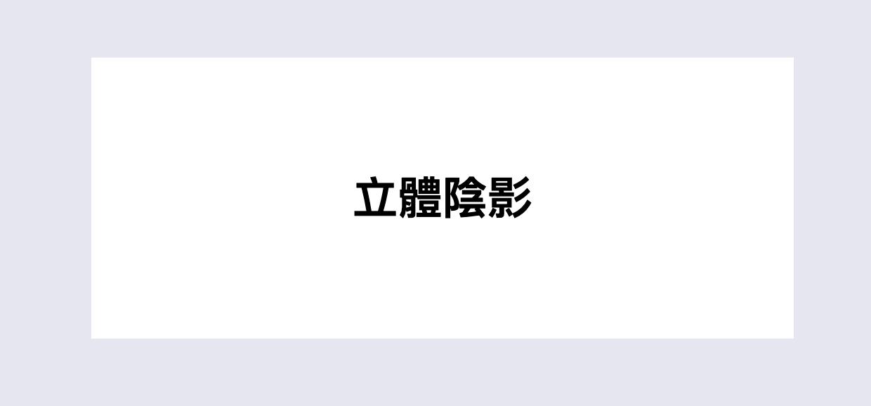
<div class="box effect">
	<h1>立體陰影</h1>
</div>
body { background-color: #e6e6f1; } .box { width: 500px; height: 200px; background-color: #fff; margin: 50px auto; } .box h1 { text-align: center; margin: 0; line-height: 200px; } -
在白色區塊背後設定兩個有陰影的小區塊,利用偽元素 before 及 after,加入 y 軸 15px 、模糊強度 15px 、色碼 #777 的陰影,特別要注意的是,背後的小區塊寬度不能大於白色區塊,並設置 z-index 為 -1,將 z 軸堆疊順序下降。
-
圖為 before 及 after 的小區塊陰影。
.effect { position: relative; } .effect:before, .effect:after { content: ''; width: 100%; max-width: 400px; position: absolute; top: 50%; bottom: 15px; z-index: -1; -webkit-box-shadow: 0 15px 10px #777; -moz-box-shadow: 0 15px 10px #777; box-shadow: 0 15px 10px #777; } -
接下來分別將小區塊旋轉,before 旋轉 -3度及距離左側內縮 10px,after 旋轉 3度及距離右側 10px。
.effect:before{ left: 10px; -webkit-transform: rotate(-3deg); -moz-transform: rotate(-3deg); -o-transform: rotate(-3deg); -ms-transform: rotate(-3deg); transform: rotate(-3deg); } .effect:after { right: 10px; left: auto; -webkit-transform: rotate(3deg); -moz-transform: rotate(3deg); -o-transform: rotate(3deg); -ms-transform: rotate(3deg); transform: rotate(3deg); } -
立體陰影效果就完成了!


相關文章